
O‘ahu
Sustainable Coastlines Hawai‘i
Everyone Has a Coastline
A new identity for Sustainable Coastlines Hawai‘i, shaped by water.
Sustainable Coastlines Hawaiʻi works across education to community action, so the identity needed to feel active and practical while remaining rooted in Hawai‘i.
Services
Visual Identity
Art Direction

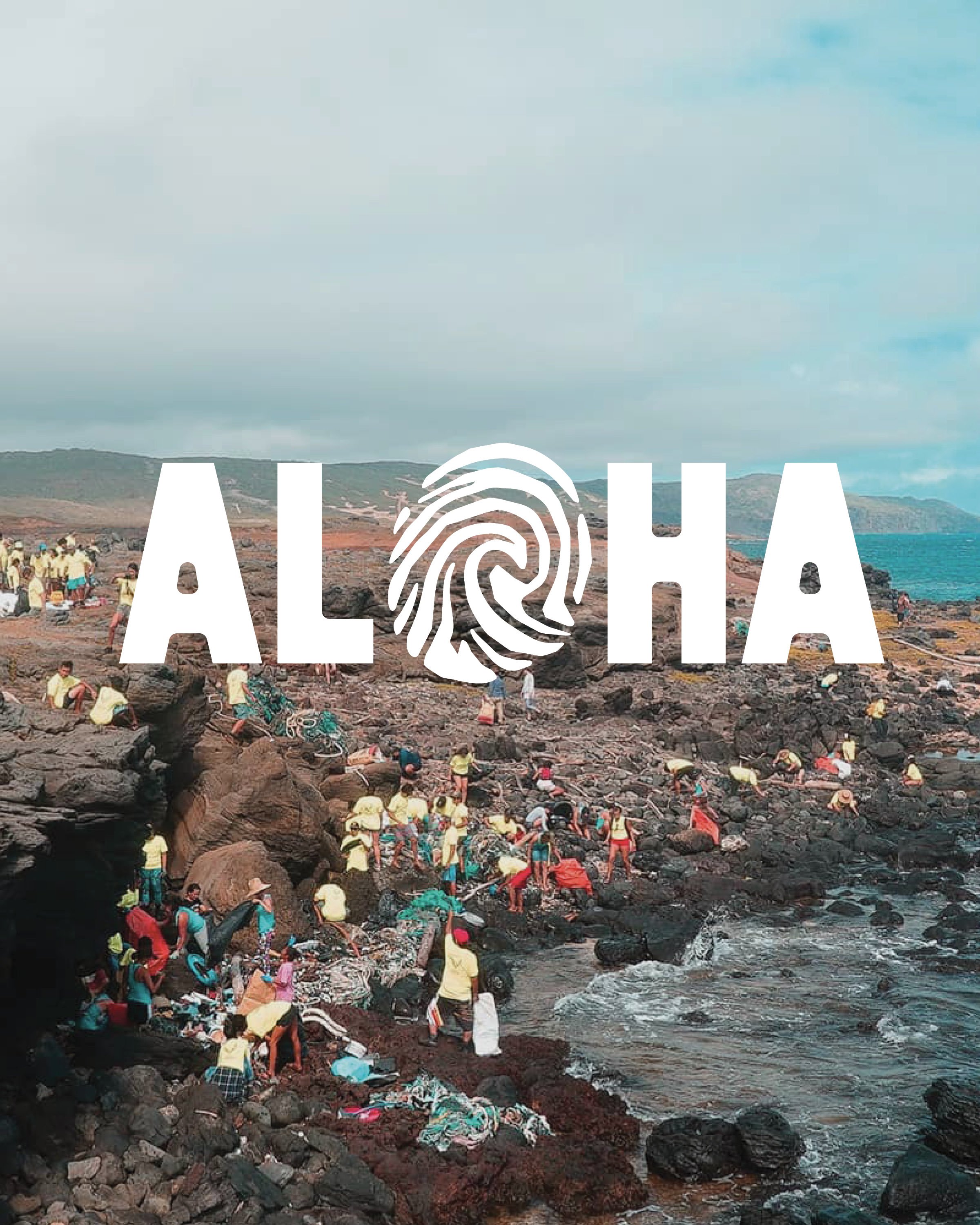
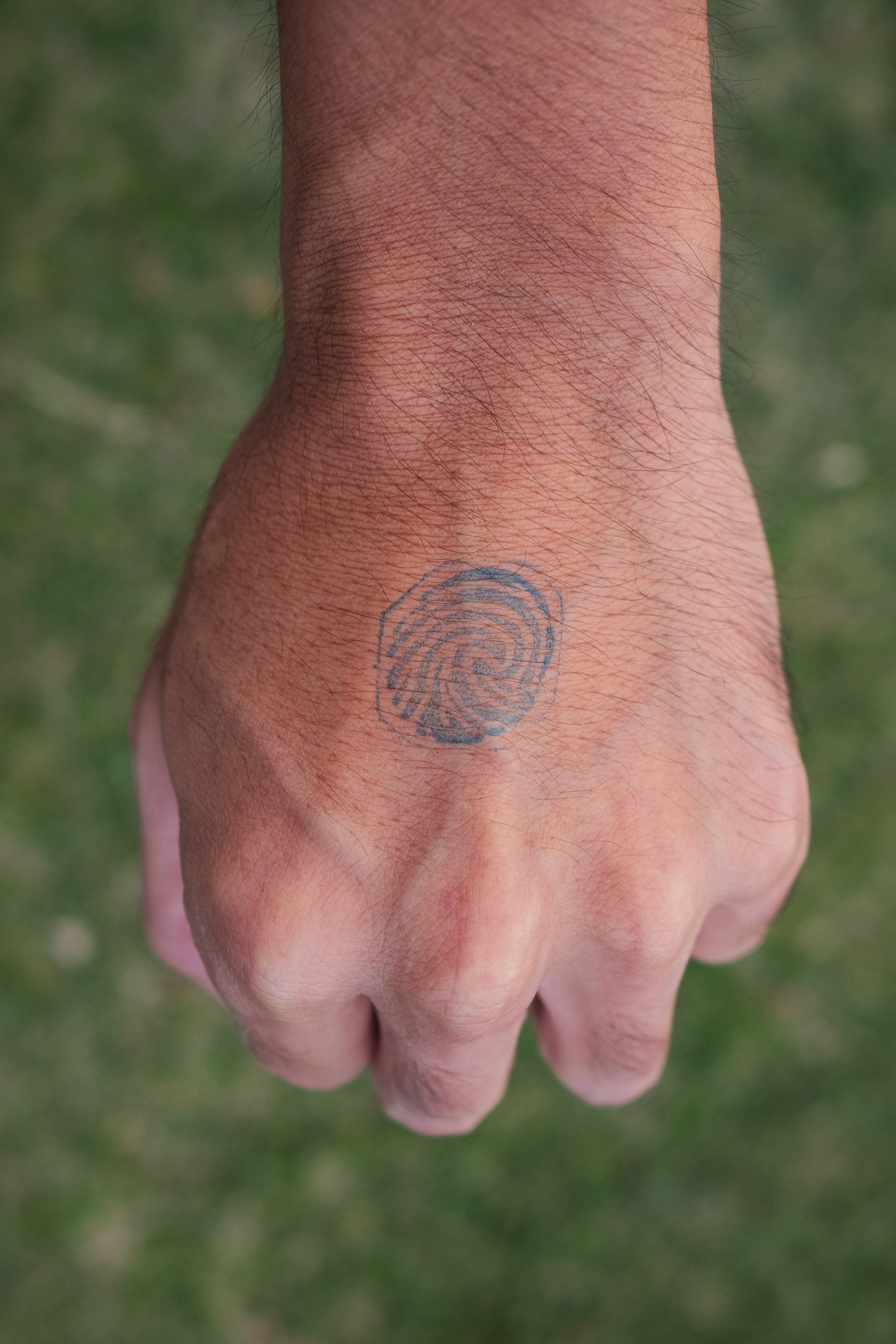
The new logo takes its cues from wai + kai (fresh water + salt water) and from the way water moves through the islands, linking upland landscapes to the coast. That sense of flow shaped the logo, which also carries the imprint of a meheu manamana lima, or fingerprint: a mark of individual presence within a larger collective effort.
The result is an identity built around connection: between land and sea, people and place, and the many small actions that contribute to lasting care for Hawai‘i’s coastlines.

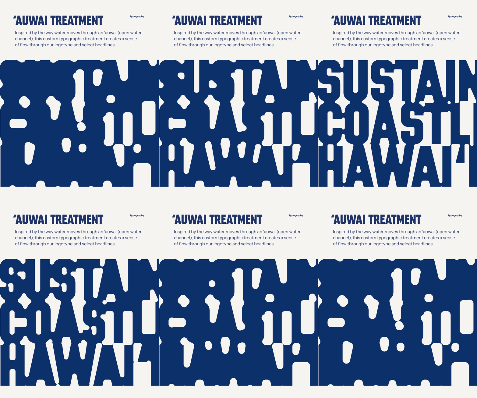
For Sustainable Coastlines Hawai‘i, we developed a typographic treatment inspired by the movement of water through an ‘auwai (open water channel). The idea was to let that sense of flow move directly through the letterforms.
Fluid openings create a visual rhythm that feels like water without losing the strength and clarity of the type.
The treatment gives SCH a recognizable voice that is bold enough to stand on its own, but flexible enough to keep in motion with the work.
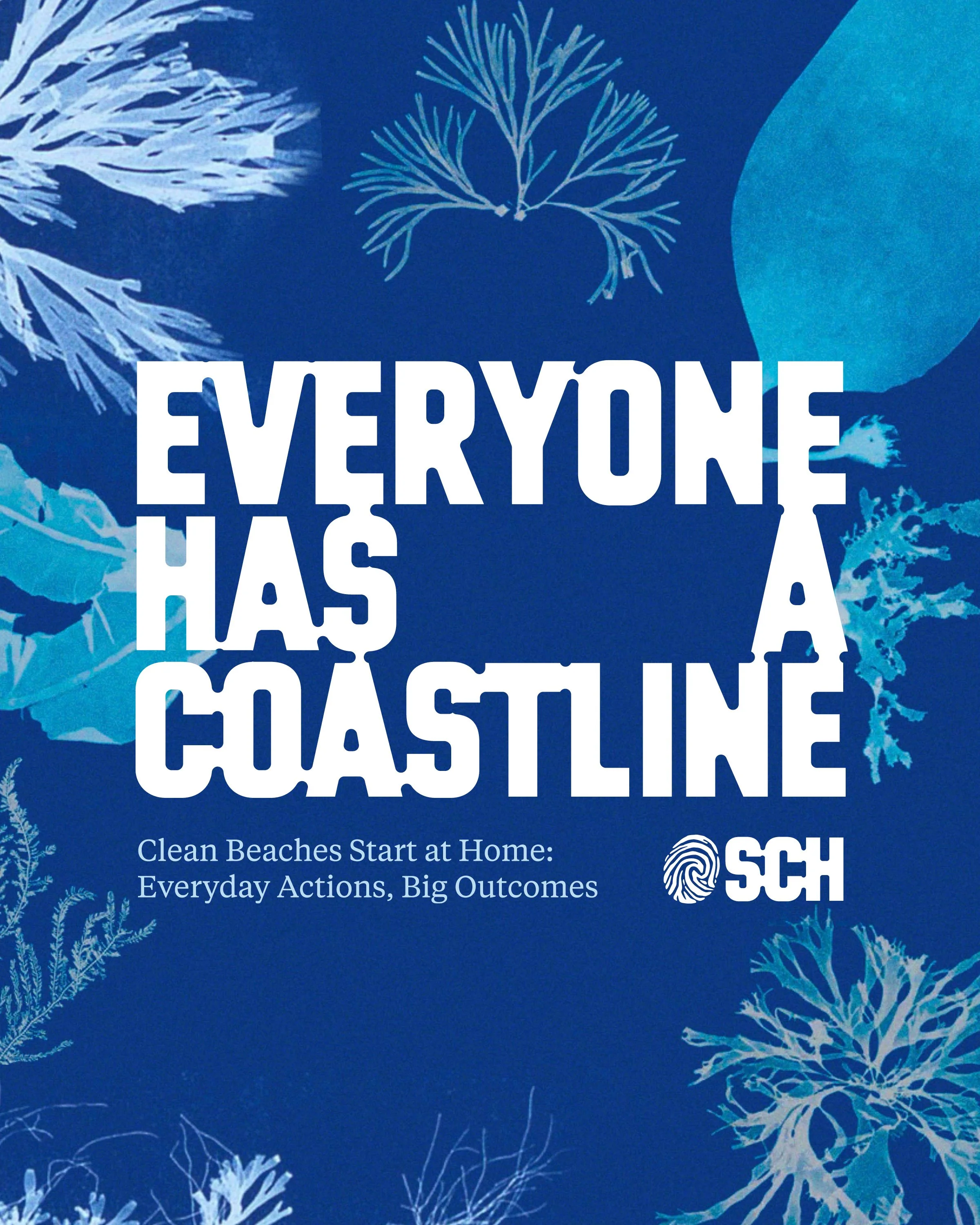
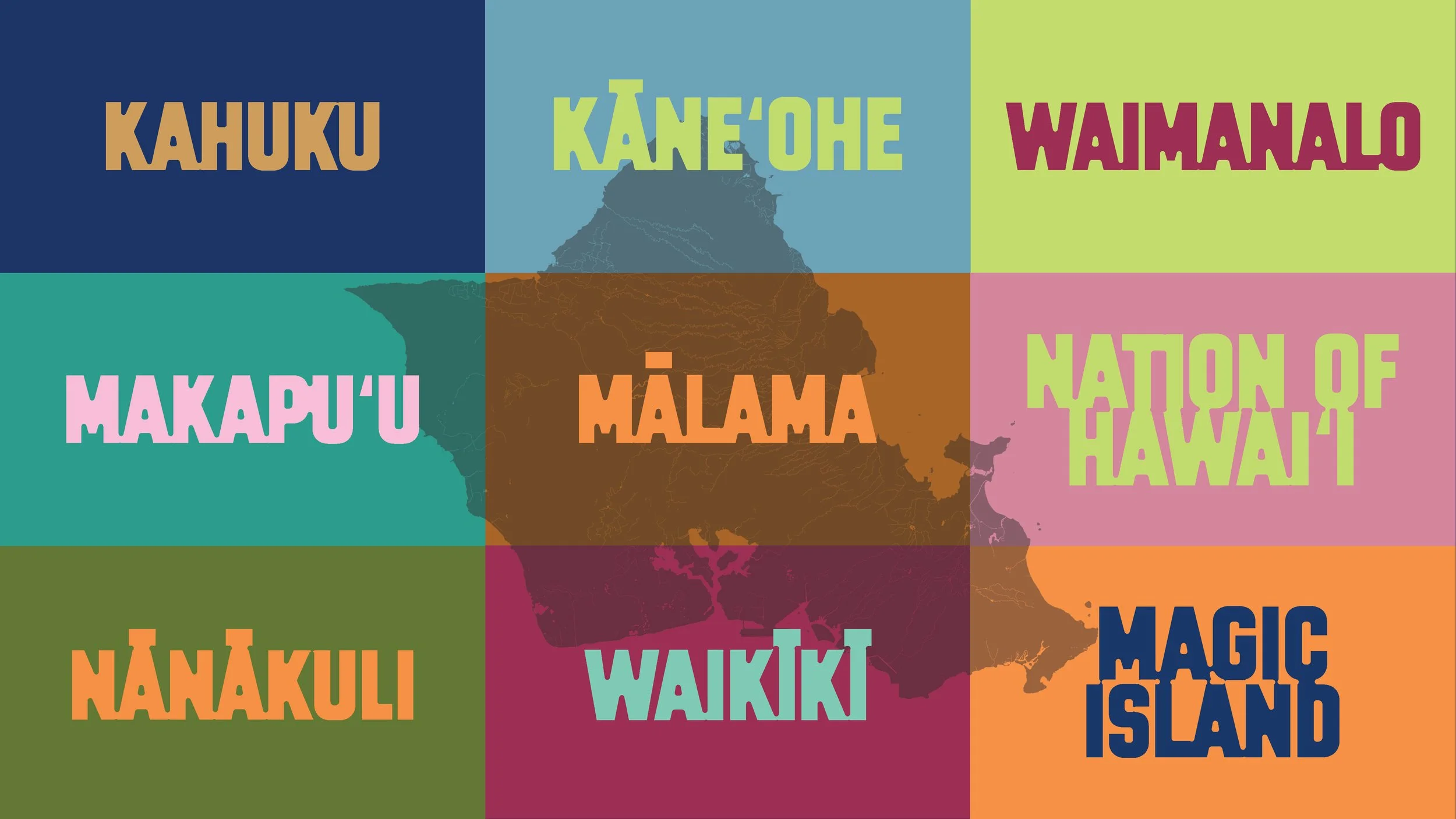
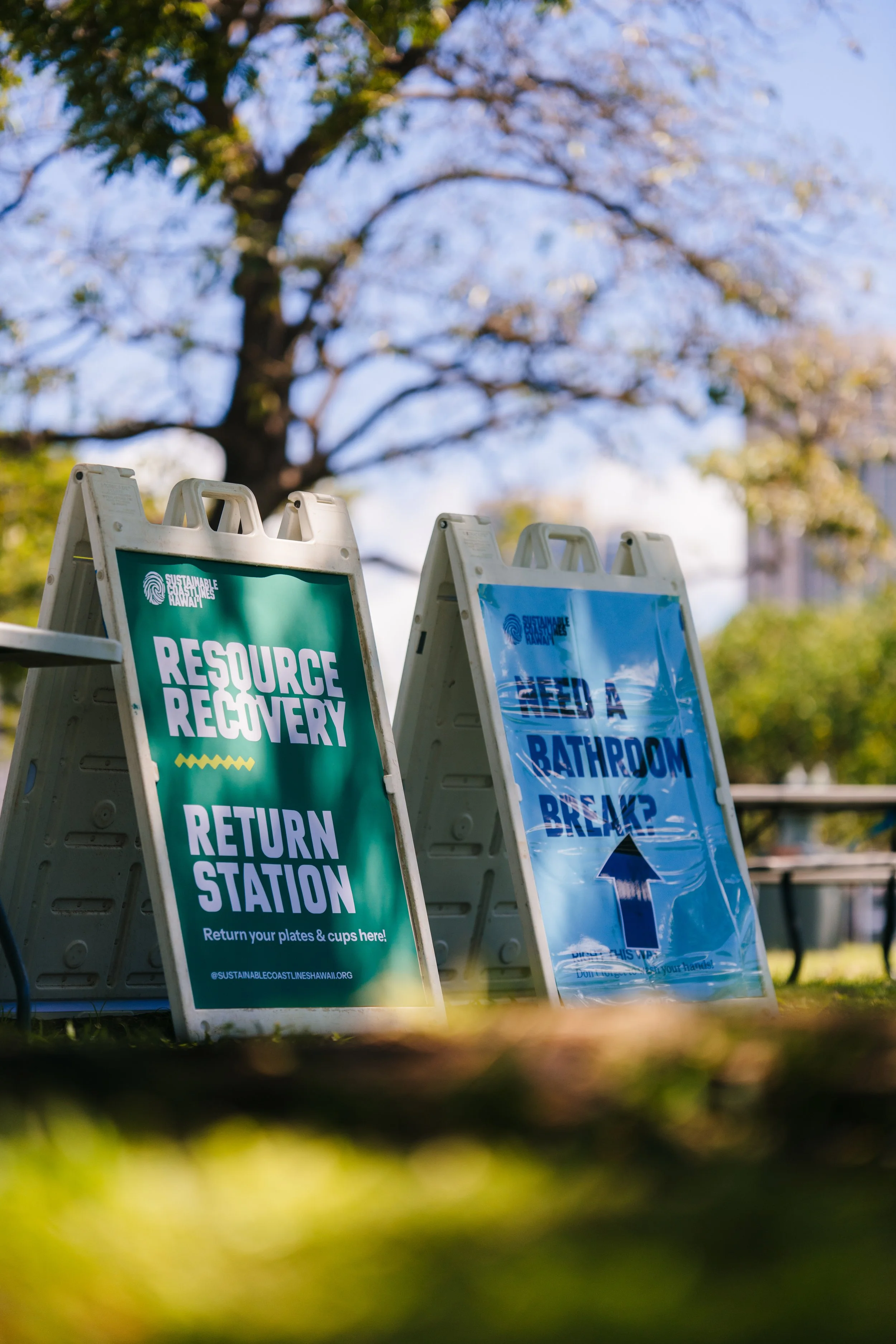
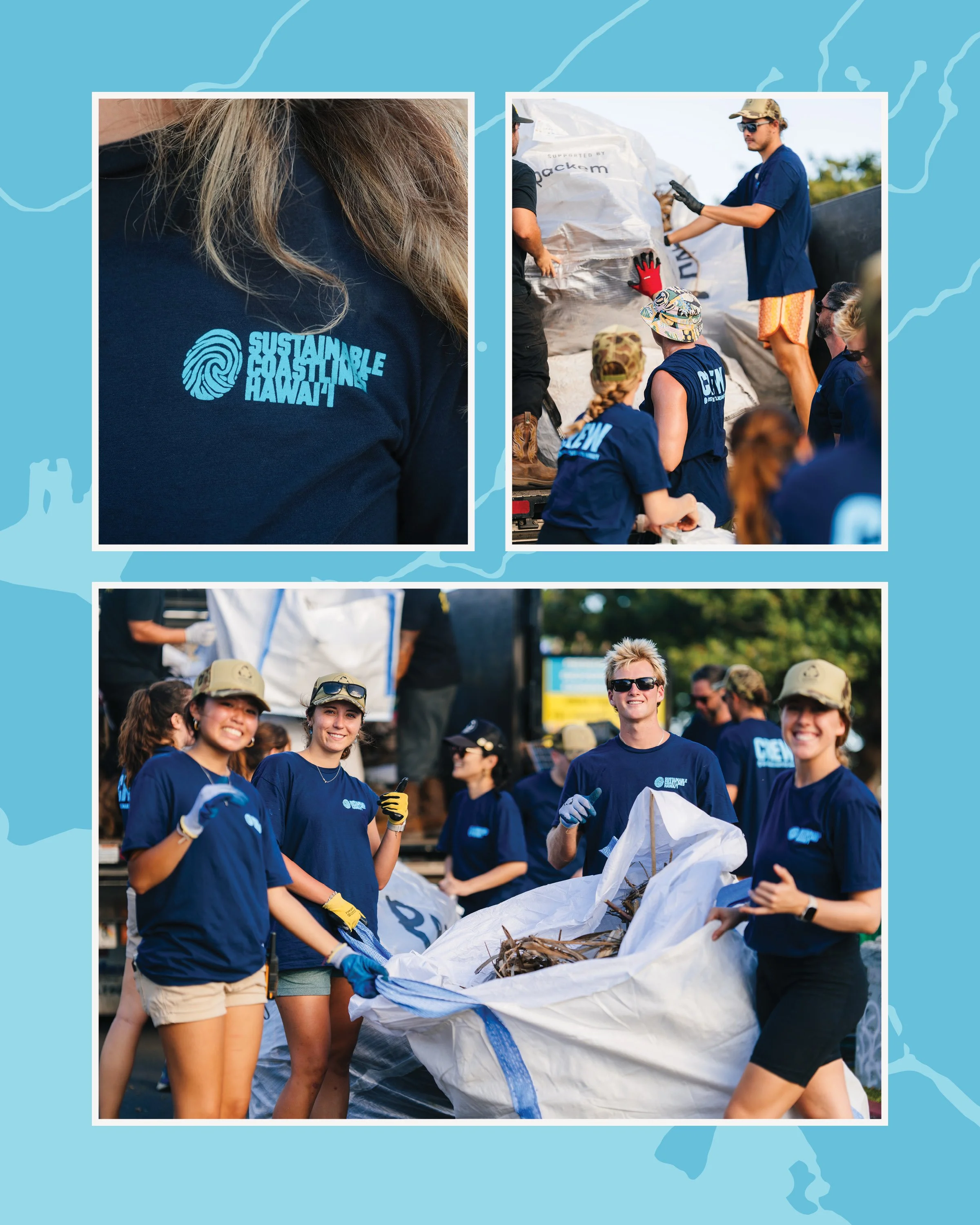
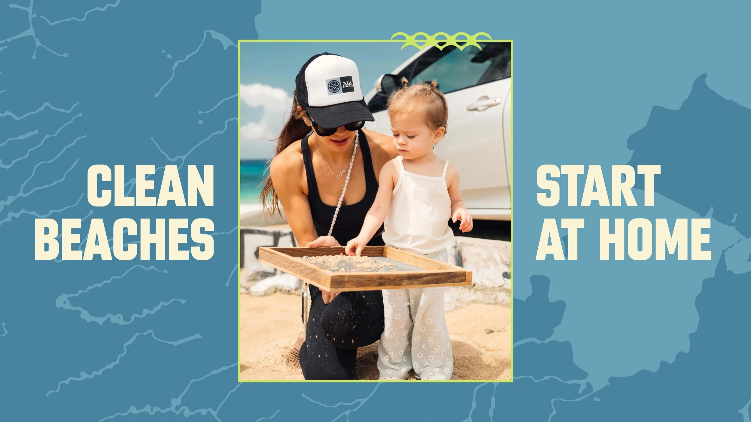
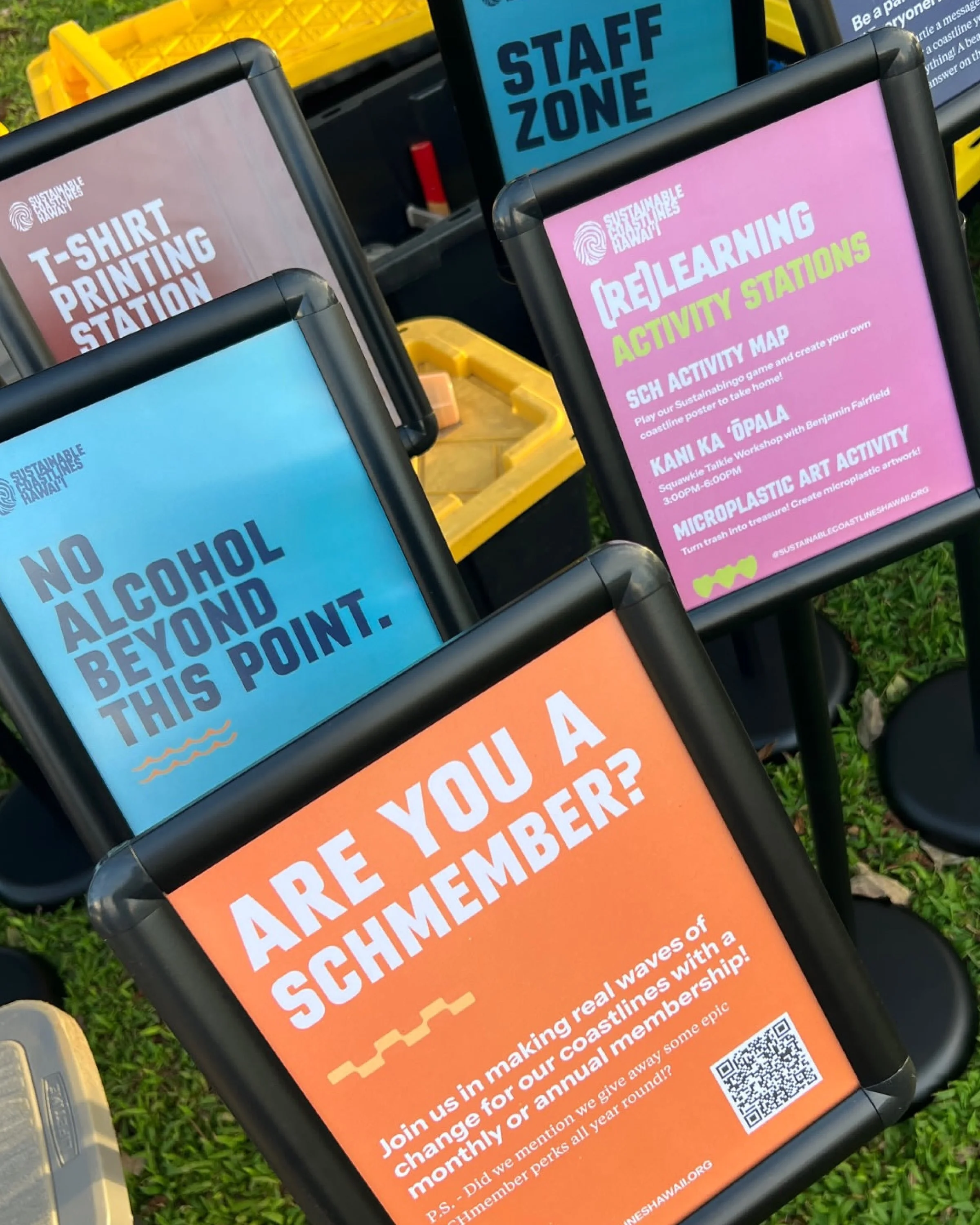
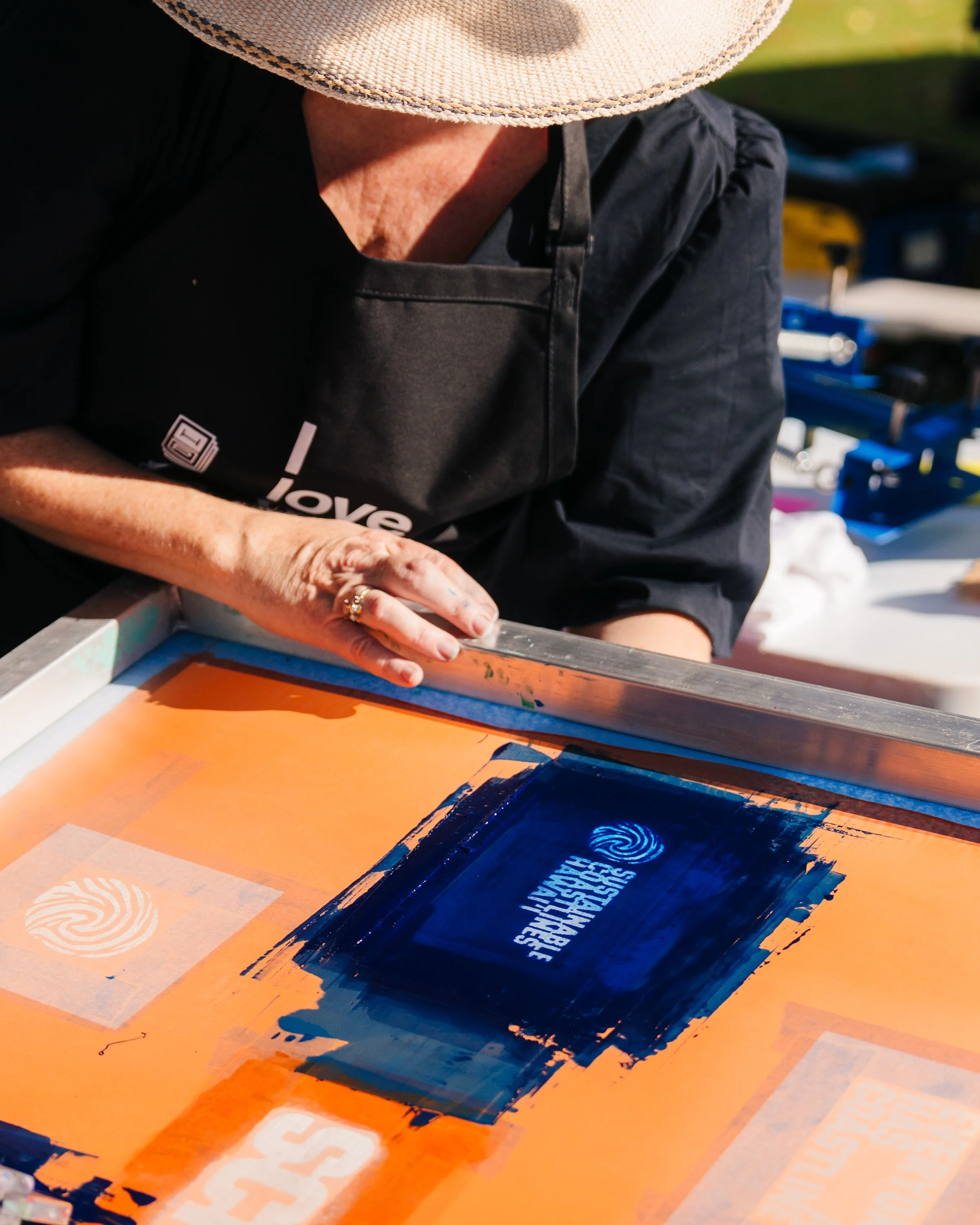
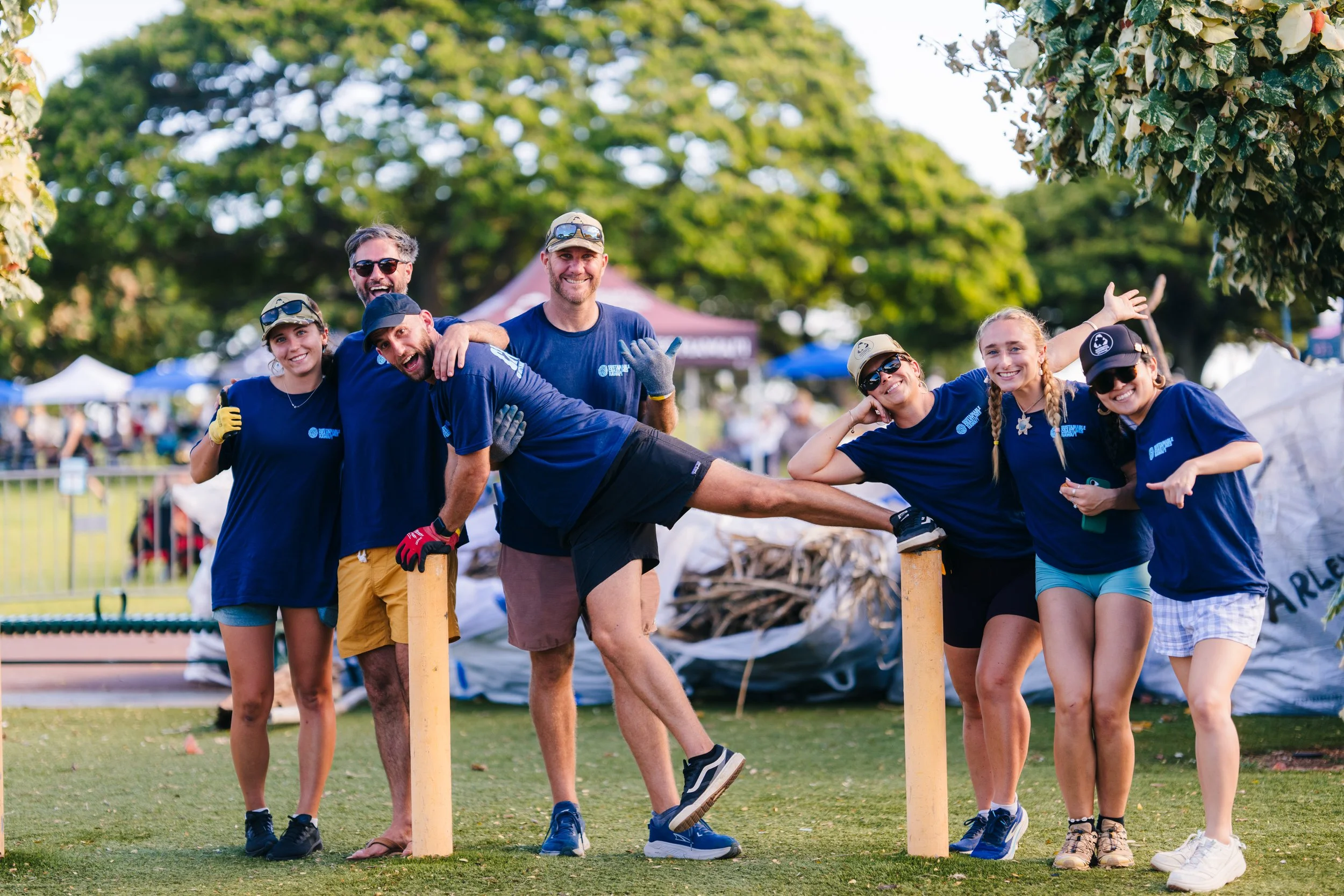
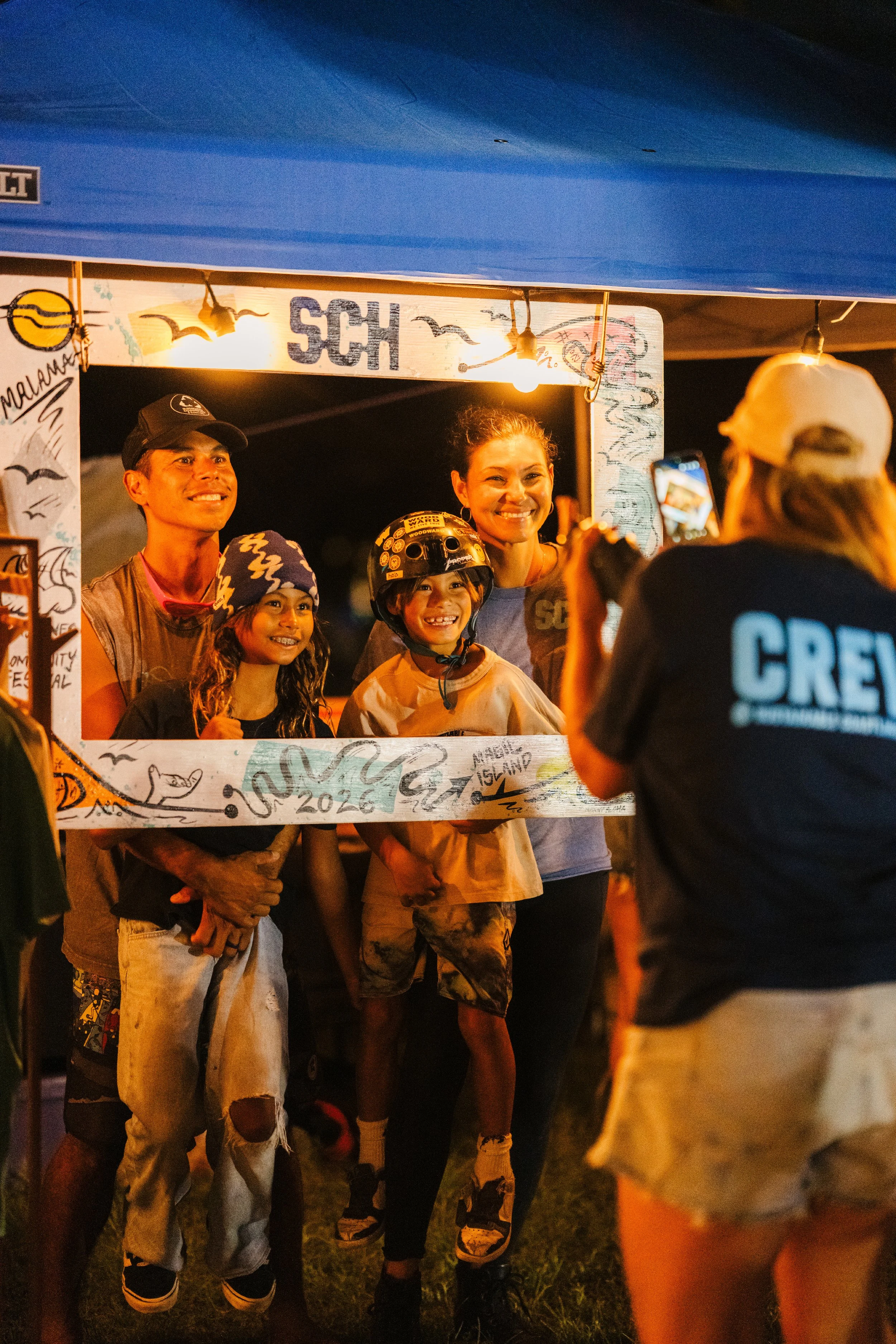
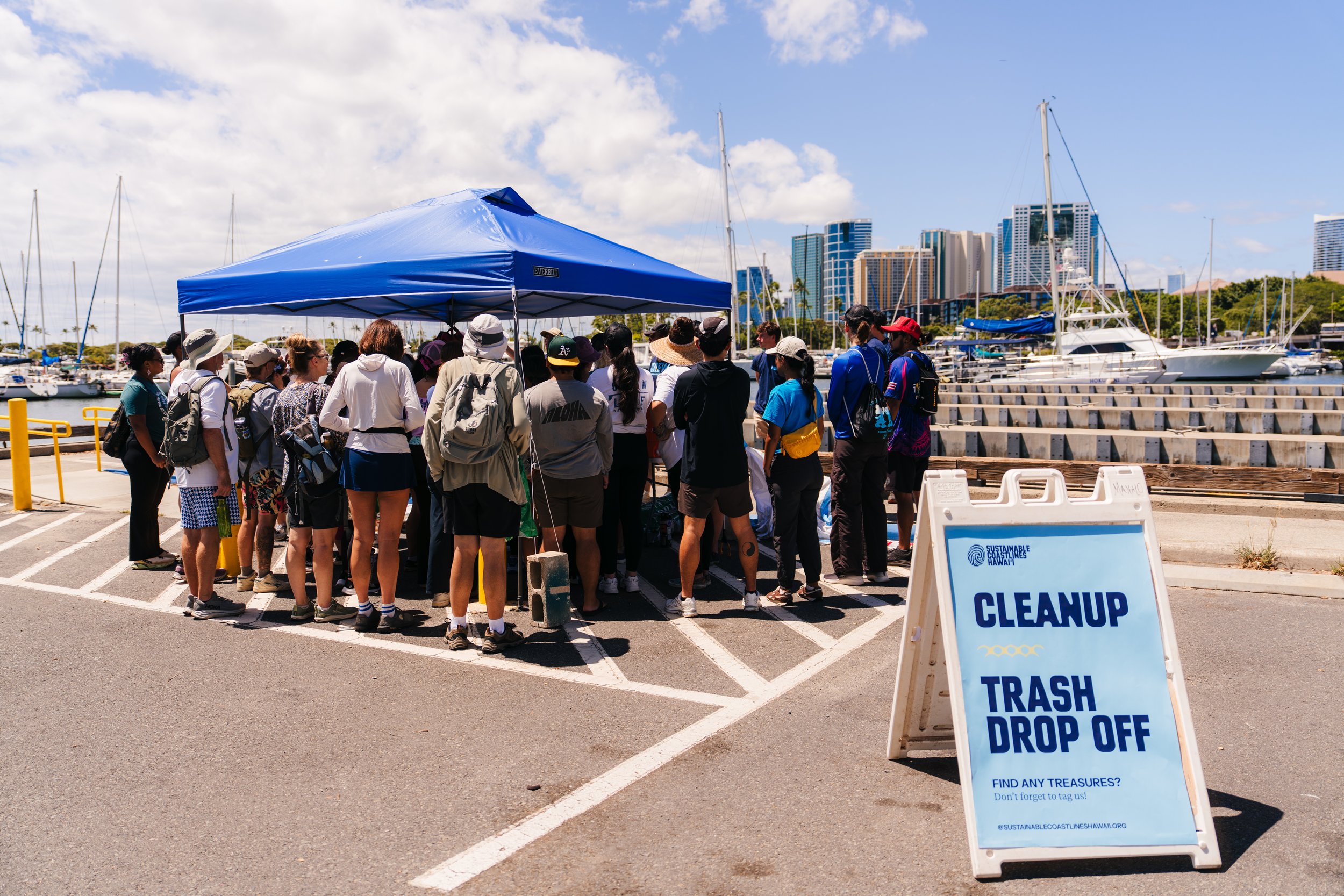
Sustainable Coastlines Hawaiʻi shows up in a lot of places — on beaches, at cleanups, in classrooms, on reports, on shirts, on signage and out in the field. The identity needed to be just as dynamic.
We built a system that could adapt across those environments while still feeling clear, strong and unmistakably connected to Hawaiʻi. The goal was not to create a rigid set of assets, but a visual language with enough structure to stay recognizable and enough flexibility to keep moving.
Clear when it needs to communicate. Bold when it needs to rally people. And always grounded in where the work happens. Letʻs get to work.